Hello partner.
Welcome to our hub for partner guidelines and assets. We want to make it easy for you to integrate Cipla in your digital or print content while respecting our brand and legal/licensing restrictions.
Our Logo
We are very proud of our logo, and we require that you follow these guidelines to ensure it always looks its best. Our logo is a simple and modern wordmark.
Exclusion Zone
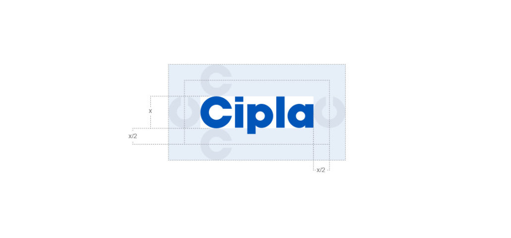
The logo’s exclusion zone is defined by the height and width of the letter ‘C’ from the Cipla logo and this should be applied for all purposes.
Logo Placement
Regardless of communication size or dimension, the Logo can only ever be placed top right. Exception to this rule is usage on packaging or in certain cases where there is no other option on logo placement.

Co-Branding
Cipla has a number of key ventures, partnerships and sponsorship agreements. To identify these initiatives, a co-branded lock-up needs to be created to ensure both brands receive exposure. Any co-branded lock-up must be created with the involvement of the Global Brand Team, and requires their approval before usage. Partner logos should never be of a greater height than the Cipla logo.

Minimum Size
Establishing a minimum size ensures that the impact and legibility of the logo is not compromised in application. Always maintain the logo’s aspect ratio when resizing.

The Cipla logo should never be smaller than 60px wide in digital or 7mm wide in print.
Logo Misuse
It is important that the appearance of the logo remains consistent. The logo should not be misinterpreted, modified, or added to. No attempt should be made to alter the logo in any way. Its orientation, colour and composition should remain as indicated in this document — there are no exceptions.

Do not use any typeface over the preferred logo.

Do not use a shadow with the logo.

Do not create outlines.

Do not apply any type of gradient to the logo.

Do not distort the typeface.

Do not crop the logo.

Do not stretch the logo, vertically or horizontally.

Do not rotate the logo.

Do not change the logo colour other than indicated.
Our Colours
Cipla has always been blue, and that won’t change. While embracing a much more colourful language in our brand communications, Cipla Blue is our resting colour, used only in situations where the brand palette is not being used.

Blue #0055b8
R37 G92 B163
C100 M65 Y0 K5
Pantone 2935

Black #231f20
R25 G20 B20
C0 M0 Y0 K100
Fonts for Digital
Poppins Semibold
Primary font
Inter Regular
Body font